Ok, what about the poster?
- Oskar Potocki
- May 11, 2020
- 1 min read
It was suggested that three people should be tasked with creating the posters for the exhibition, although everyone was welcome to try.
The main source of inspiration was this kind of design:

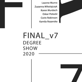
Leanne has created following design:

Whilst I like it a lot, I don't see any way we can improve it or make it more interesting, and it's a little bit tight - as in it doesn't reflect our characters at all. It's just "a poster".
Kamila has created an interesting, grunge style piece as can be seen below:

It's significantly better at reflecting our art style, and how desperate everyone is. It is however a bit too negative, and a final product should be a bit more cheerful.
Following are the designs produced by Leanne. I can appreciate what she tried to achieve, but I am not too keen on the colour combination - the orange and blue don't represent us as much as I'd want to.


Following are the designs of Karen. Unfortunately, I dislike all of them, not finding anything satisfactory about them. The use of default fonts without any consideration, as well as the colour palette makes it look like they have been designed hastily without any regard for layout and object weight.


Comments